Mastering the Basics of CSS: A Beginner’s Guide
Posted on 13 Feb 2023
Introduction
In this article, we will continue to build our website with HTML and CSS. I am going to show you how to style the website we created in the previous article improving its look and feel.
What is CSS?
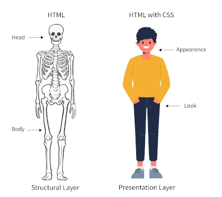
Photo from https://www.scaler.com
CSS (Cascading Style Sheets) is a styling language used to control the presentation of web pages. It is used to define the layout, colors, typography, and other visual elements of a web page. CSS allows you to separate the presentation of a web page from its structure, which is defined using HTML.
CSS has become an essential part of web development, as it allows you to create visually appealing and responsive designs that adapt to different screen sizes and devices. With CSS, you can control the position and layout of elements, create animations and transitions, and define the typography and colors of a web page.
In this article, we will explore the basics of CSS and how it can be used to enhance the visual design of web pages. We will cover topics such as selectors, cascading, the box model, layout, typography, color and background, transitions and animations, and responsive design. By the end of this article, you will have a solid understanding of how to use CSS to create visually stunning and responsive web pages.
CSS Rules and Declarations
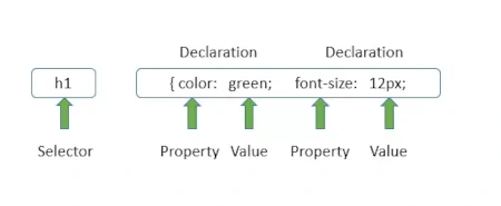
Photo from https://www.coderepublics.com
A CSS file is essentially a list of CSS rules, where each rule consists of a selector and a declaration block. A selector determines which HTML elements on a page will be affected by the styles defined in the rule. For example, an h1 selector would apply styles to all h1 headings on a page. A declaration block is a set of styles to be applied to the selected element. It consists of a property and a value, separated by a colon and surrounded by curly braces. For example:
h1 {
    color: blue;
    font-size: 36px;
    text-align: center;
}
In this example, the selector h1 applies the styles to all h1 headings on the page. The declaration block sets the text color to blue, the font size to 36 pixels, and the text alignment to the center. It’s important to note that multiple CSS rules can apply to a single HTML element, and the order of the rules in the CSS file determines which styles will take priority (known as the cascading effect). The last style declared for a given property wins and overrides any previous styles.
CSS Inheritance
Photo from https://sites.google.com/site/csstricksandtips
In CSS, inheritance refers to the mechanism by which certain CSS property values are passed from a parent element to its children. This allows for a more efficient and organized way to apply styles to elements in an HTML document.
For example, if you set the font-size property on a body element, all its child elements will also inherit that font-size property value. If you then set the font-size property on a child element, it will override the inherited value and apply its unique font-size value.
It’s important to note that not all CSS properties are inherited. For example, the padding and margin properties are not inherited.
Inheritance can be a useful tool for maintaining consistency in styling and reducing the amount of code that needs to be written. However, it can also lead to unintended consequences if not used carefully. For example, if you have a large number of nested elements, inheritance can make it difficult to understand the styling of a particular element without carefully examining the hierarchy of elements in the HTML document.
CSS Selectors and Cascading: The Building Blocks of Web Design
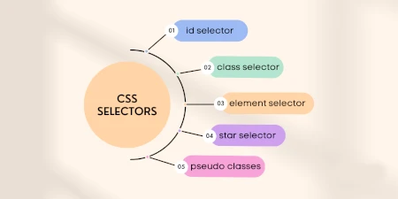
Photo from https://www.atatus.com
In CSS, selectors are used to select elements on a web page that you want to apply styles. There are several types of selectors, including:
- Element selectors: Select elements based on their tag name, such as “p” for paragraphs or “a” for links.
- Class selectors: Select elements based on their class attributes, using a period (.) before the class name. For example, “.my-class” would select all elements with the class “my-class”.
- ID selectors: Select elements based on their id attribute, using a hash (#) before the id name. For example, “#my-id” would select the element with the id “my-id”.
- Attribute selectors: Select elements based on their attributes and attribute values. For example, “[href=’https://example.com’]” would select all elements with an href attribute equal to “https://example.com”.
Cascading refers to how styles are applied to elements when multiple stylesheets and/or styles are conflicting. When multiple styles apply to the same element, the browser uses the following rules to determine which style to use:
- Specificity: Styles with a higher specificity are given priority. For example, an ID selector has a higher specificity than a class selector.
- Origin: Styles that are defined in the user’s browser have lower priority than those defined in the author’s stylesheet.
- Importance: Styles that are marked as “!important” have higher priority than those that are not.
Finally, cascading also works with the order of styles in the CSS file, styles defined later on in the file will overwrite previous styles.
It’s important to keep in mind specificity and cascading rules when working with CSS to avoid unexpected results.
Element Selector:
/* This will select all <p> elements and make their text color red */
p {
    color: red;
}
Class selector:
/* This will select all elements with the class "my-class" and make their background color yellow */
.my-class {
    background-color: yellow;
}
ID Selector:
/* This will select the element with the ID "my-id" and make it's font-size 20px */
#my-id {
    font-size: 20px;
}
Attribute Selector:
/* This will select all <a> elements with an href attribute equal to "https://example.com" and make their text color blue */
a[href='https://example.com'] {
    color: blue;
}
It’s also possible to use attribute selectors to match elements with a specific attribute value prefix, suffix, or substring by using “^”, “$”, “*” respectively.
/* This will select all <input> elements with a name attribute that starts with "user" and make their border red */
input[name^='user'] {
    border: 1px solid red;
}
It’s important to note that attribute selectors are more performance-intensive than the other types of selectors, so it’s best to use them sparingly and with caution.
Also, it’s good practice to use class and ID selectors to select elements, instead of element selectors because it makes the CSS more reusable and less specific, avoiding the risk of changing the visual of unintended elements.
The Box Model
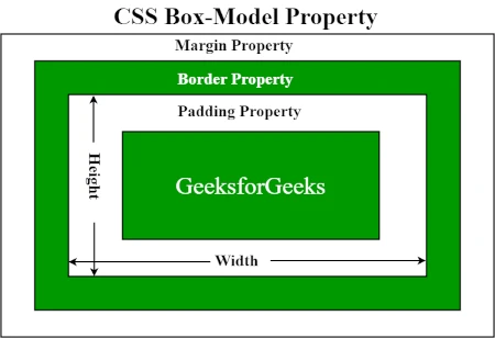
Photo from https://www.geeksforgeeks.org/
The box model is a concept in CSS that describes the layout of an HTML element as a rectangular box. Each box has four main parts: the content, padding, border, and margin.
-
Content: This is the area where the element’s content is displayed, such as text or images. A Content element has a size expressed by the properties’ width and height. You can also use properties like min-width, min-heigth, max-width, and max-height to declare the minimum and maximum size.
-
Padding: This is the space between the content and the border. You can control the padding using the padding property and its related properties such as padding-top, padding-right, padding-bottom, padding-left.
-
Border: This is the line that surrounds the padding and content. You can control the border using the border property and its related properties such as border-width, border-color, border-style.
-
Margin: This is the space outside of the border. You can control the margin using the margin property and its related properties such as margin-top, margin-right, margin-bottom, margin-left.
When you set the width and height of an element, by default, it’s the width and height of the content area. However, you can include the padding, border, and margin by using the box-sizing property with the value “border-box”. The box-sizing property in CSS determines how the dimensions of an element are calculated. It specifies whether the width and height of an element should include the border and padding or not. There are two possible values for box-sizing:
-
content-box (the default value): the dimensions of an element are determined only by its content, excluding the border and padding.
-
border-box: the dimensions of an element include both the content and the border and padding.
For example, if you specify a width of 200 pixels for an element with a 10-pixel border and 20-pixel padding, the element will have a total width of 250 pixels with box-sizing: content-box and 200 pixels with box-sizing: border-box. The box-sizing property can be useful for managing layout issues when working with fixed dimensions, as it allows for a more precise prediction of how spaces will be distributed.
/* This will make the width and height properties include the padding and border */
.my-class {
    box-sizing: border-box;
    width: 200px;
    height: 100px;
    padding: 10px;
    border: 1px solid #000;
    margin: 20px;
}
It’s important to understand the box model and how the different parts interact with each other because it affects the layout and spacing of elements on a web page. Additionally, the box-sizing property can be very useful to control the dimensions of an element in a more intuitive way.
Layout in CSS
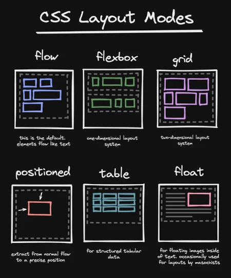
Photo from https://www.reddit.com
Layout in CSS refers to the positioning and arrangement of elements on a web page. There are several layout techniques that you can use to control the position of elements, such as:
-
display property: This property is used to specify the type of box an element should generate. The most common values are block, inline, and inline-block. Block elements take up the full width of their parent container, and create a new line after them. Inline elements only take up as much width as their content and do not create a new line after them. Inline-block elements are similar to inline elements, but they can have dimensions set with width and height properties, and they also create a new line after them.
-
position property: This property is used to specify the positioning of an element. The possible values are static, relative, absolute, and fixed. Static is the default value and means that the element will be positioned according to the normal flow of the document. Relative means that the element will be positioned relative to its normal position, using the left, right, top, and bottom properties. Absolute means that the element will be positioned relative to its nearest positioned ancestor, using the same properties. Fixed means that the element will be positioned relative to the viewport, and it will remain in the same position even when the page is scrolled.
-
float property: This property is used to make an element float to the left or right of its parent container. The possible values are left and right. When an element is floated, it will move to the left or right of its parent container, and other elements will flow around it.
-
flexbox and grid layout: These are advanced layout techniques that are used to create flexible and responsive layouts. Flexbox is used to create a layout in one dimension, either a row or a column, and grid is used to create a layout in two dimensions, rows, and columns. Both flexbox and a grid provide powerful layout capabilities that allow you to control the size, alignment, and positioning of elements on a web page in a more flexibly and efficiently way.
It’s important to keep in mind that the layout techniques should be used in combination to make the layout of a webpage more optimal and adaptable to different viewports. Additionally, it’s good practice to use semantic HTML and to style according to the meaning of the elements, as this will make the layout more robust and maintainable.
Typography in CSS
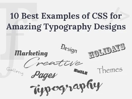
Photo from https://wpdaddy.com
Typography in CSS refers to the control of the font, size, and spacing of text on a web page. Here are some key concepts in typography:
-
font-family: This property is used to specify the font for an element. The value can be a specific font name, such as “Arial” or “Times New Roman”, or a generic font family, such as “serif” or “sans-serif”. It’s also possible to specify a list of fonts, in case the first one is not available on the client device, the next one will be used.
-
font-size: This property is used to specify the size of the text. The value can be specified in different units, such as pixels (px), points (pt), or ems (em).
-
font-weight: This property is used to specify the boldness of the text. The possible values are normal and bold. It’s also possible to use numeric values from 100 to 900, where 400 is the same as normal and 700 is the same as bold.
-
line-height: This property is used to specify the spacing between lines of text. The value can be specified in different units, such as pixels or ems.
-
letter-spacing and word-spacing: These properties are used to specify the spacing between letters and words, respectively. The value can be specified in different units, such as pixels or ems.
-
text-align: This property is used to specify the alignment of text within an element. The possible values are left, right, center, and justify.
-
text-transform: This property is used to specify the capitalization of text. The possible values are none, uppercase, lowercase, and capitalize.
-
text-decoration: This property is used to specify the decoration of text. The possible values are none, underline, overline, line-through, and blink (this one is not widely supported, use it with caution)
It’s important to keep in mind that typography is an important aspect of web design, and it can greatly impact the readability and aesthetics of a web page. Additionally, it’s good practice to use web-safe fonts and consider the accessibility guidelines when choosing the font family and size to ensure that the text is legible for users with visual impairments.
Color and Background in CSS
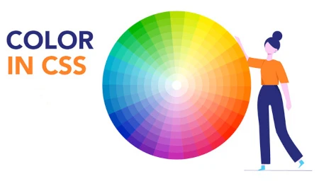
Photo from https://edu.gcfglobal.org
Color and background in CSS refer to the control of the color and background of elements on a web page. Here are some key concepts in color and background:
-
color: This property is used to specify the text color of an element. The value can be specified in several ways, such as using color names (e.g. “red”), RGB values (e.g. “rgb(255, 0, 0)”), or hexadecimal values (e.g. “#ff0000”).
-
background-color: This property is used to specify the background color of an element. The value can be specified in the same ways as the color property.
-
background-image: This property is used to specify an image as the background of an element. The value is the URL of the image file.
-
background-repeat: This property is used to specify how the background image should be repeated. The possible values are repeat, repeat-x, repeat-y, and no-repeat.
-
background-position: This property is used to specify the position of the background image. The value can be specified in several ways, such as using keywords (e.g. “center”), length units (e.g. “10px 20px”), or percentages (e.g. “50% 50%”).
-
background-size: This property is used to specify the size of the background image. The value can be specified in several ways, such as using keywords (e.g. “cover”), length units (e.g. “200px 100px”), or percentages (e.g. “50% 50%”).
-
background-clip and background-origin: These properties are used to specify the area where the background image and color should be applied. The possible values of background-clip are border-box, padding-box, and content-box, and the possible values of background-origin are padding-box and content-box.
It’s important to keep in mind that color and background can greatly impact the aesthetics of a web page, and they should be used in a harmonious way to create a visually pleasing design. Also, it’s good practice to consider the accessibility guidelines when choosing color combinations and contrasts to ensure that the text is legible for users with visual impairments.
Transitions and animations in CSS
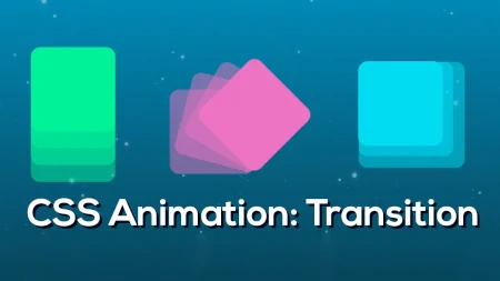
Photo from https://edu.gcfglobal.org
Transitions and animations in CSS are used to create smooth and fluid visual effects when elements change their state.
- transition: This property is used to specify the transition effect that should be applied to an element when its state changes. The property takes several values, such as the property that will be transitioned (e.g. “color”), the duration of the transition (e.g. “1s”), the timing function (e.g. “ease-in-out”), and the delay before the transition starts (e.g. “0.5s”).
/* This will make the transition of the color property to last 1 second, with an ease-in-out timing function and a delay of 0.5s */
.my-class {
    transition: color 1s ease-in-out 0.5s;
}
- animation: This property is used to specify a series of keyframes that define the animation effect. The property takes several values, such as the name of the animation (e.g. “my-animation”), the duration of the animation (e.g. “1s”), the timing function (e.g. “ease-in-out”), the number of times the animation should be played (e.g. “infinite”), and the delay before the animation starts (e.g. “0.5s”).
/* This will make the animation to be named 'my-animation', last 1 second, with an ease-in-out timing function, to be played infinite times and a delay of 0.5s */
.my-class {
    animation: my-animation 1s ease-in-out infinite 0.5s;
}
The keyframes need to be defined separately, usually in a different CSS file or in a style tag. The keyframes rule is used to define the styles that the animation should have at different points in time.
@keyframes my-animation {
    0% {
        transform: rotate(0deg);
    }
    100% {
        transform: rotate(360deg);
    }
}
This animation will rotate the element from 0 degrees to 360 degrees in 1 second, with an ease-in-out timing function, and will repeat infinitely with a delay of 0.5s.
It’s important to keep in mind that transitions and animations can greatly enhance the user experience and make a web page more interactive. However, it’s good practice to use them in a subtlly and appropriatly way, to avoid overwhelming the user and to make sure that the animation does not interfere with the functionality of the page.
Responsive design in CSS

Photo from https://www.tutorialspoint.com
Responsive design in CSS is used to create web pages that adapt to different screen sizes and resolutions. The main idea behind responsive design is to use flexible grids, flexible images, and media queries to create a layout that adjusts to the size of the viewport.
- media queries: This is a CSS technique that allows you to apply different styles based on the characteristics of the device and the viewport. Media queries use a set of CSS rules that are only applied when certain conditions are met, such as the width or height of the viewport, the resolution of the screen, or the type of device.
/* This media query will apply the styles inside of it when the width of the viewport is less than 600px */
@media only screen and (max-width: 600px) {
    /* styles go here */
}
-
flexbox and grid layout: These layout techniques are very useful for responsive design because they allow you to create flexible and adaptive layouts that adjust to the size of the viewport. Flexbox is used to create a layout in one dimension, either a row or a column, and a grid is used to create a layout in two dimensions, rows, and columns.
-
viewport: This is the area of the browser window where the web page is displayed. The viewport can be controlled using the viewport meta tag, this will allow you to set the width and initial scale of the viewport, and it will affect the layout of the page and the sizes of elements on the page.
<meta name="viewport" content="width=device-width, initial-scale=1">
It’s important to keep in mind that responsive design is crucial for creating a good user experience in today’s web, where people access the internet from a wide range of devices and screen sizes. Additionally, it’s good practice to test the layout on different devices and screen sizes during the development process to ensure that the layout is consistent and adaptable across different platforms.
How to Include CSS in a web page
Photo from https://www.hostinger.com
CSS can be included in a web page in three different ways: inline, internal, and external.
Inline CSS refers to writing CSS styles directly within an HTML element using the “style” attribute. This method is useful for applying styles to a specific element but is not recommended for larger stylesheets as it makes the HTML code cluttered. For example:
<p style="color: blue; font-size: 16px;">This is a paragraph with inline CSS</p>
Internal CSS refers to writing CSS styles within the head section of an HTML document, within a “style” tag. This method is better than inline CSS as it keeps the CSS styles separated from the HTML content but is still not recommended for larger stylesheets as it requires the same CSS code to be duplicated in each HTML file. For example:
<head>
    <style>
        p {
            color: blue;
            font-size: 16px;
        }
    </style>
</head>
External CSS refers to writing CSS styles in a separate file with a .css extension and linking it to an HTML document. This method is the best way to implement CSS in a web page as it separates the styles from the HTML content and allows for a single stylesheet to be used across multiple pages. This reduces the amount of code duplication and makes it easier to maintain the styles. To include an external CSS file, the “link” tag is used within the head section of the HTML document. For example:
<head>
  <link rel="stylesheet" type="text/css" href="style.css">
</head>
In conclusion, while inline and internal CSS are quick and easy to implement, it is best practice to use external CSS in web development for the maintainability and organization of code.
Applying CSS Principles to Create a Website Style
Photo from https://fronty.com
In order to enhance the look and feel of the 5 pages created in the previous article Getting Started with HTML, we will now create a CSS stylesheet that will apply the principles discussed earlier to these pages.
First, it is necessary to include the following line of code in each of the 5 HTML pages:
<link rel="stylesheet" type="text/css" href="style.css">
This line of code associates the HTML file with the new CSS file “style.css”.
Next, in the CSS file, we will define a basic layout for the page by applying the following code to the “body” element:
body {
    margin: 0 auto;
    font-family: 'Helvetica Neue';
    font-size: 13px;
    max-width: 1080px;
}
This code tells the browser to set the top and bottom margins to 0, and to calculate the left and right margins automatically based on the page size and the size of the browser screen. The maximum width of the text is set to 1080px. Additionally, the code sets the default font size to 13px and the font type to ‘Helvetica Neue’.
For the headings (h1, h2, h3, h4, h5, h6), we set the following styles:
h1, h2, h3, h4, h5, h6 {
    color: #3b3b3b;
    text-align: left;
}

h1 {
    font-size: 28px;
}

h2 {
   font-size: 24px;
}

h3 {
    font-size: 20px;
}

h4 {
    font-size: 18px;
}

h5 {
    font-size: 16px;
}

h6 {
    font-size: 14px;
}
The heading font sizes range from 14px for h6 to 28px for h1, and all headings will have a color of #3b3b3b and be left-aligned.
For the paragraphs, we set the text alignment to justify:
p {
    text-align: justify
}
For ordered lists, we set the list style position to be inside the text:
ol {
    list-style-position: inside;
}
For blockquotes, we set the following styles:
blockquote {
    background: #f5f7f9;
    border-bottom: 1px solid #d8dee9;
    padding: 10px 10px 10px 10px;
}
The background color is set to #f5f7f9, the bottom border is set to 1px solid and colored #d8dee9, and there is a padding of 10px around the entire quote.
For images, we want them to alternate between appearing on the left and right of the text, with the text flowing around them. To achieve this, we will apply the following code:
img.img-left {
    padding: 10px 10px 10px 0px;
    float:left
}

img.img-right {
    padding: 10px 0px 10px 10px;
    float:right
}
As you can see, the images have a padding of 10px all around except on the side where they are aligned. The float attribute expresses how the text should flow.
The entire code can be found here: https://github.com/sasadangelo/html-hero/tree/master/part-1/lesson-11
Conclusion
In conclusion, CSS is an essential tool for web design, allowing for the creation of beautiful and functional websites. From understanding selectors and cascading to exploring the box model, typography, color and background, transitions and animations, and responsive design, this article has covered the fundamental concepts and techniques of CSS. By mastering CSS, you have the power to transform your web pages and bring your vision to life. Happy styling!